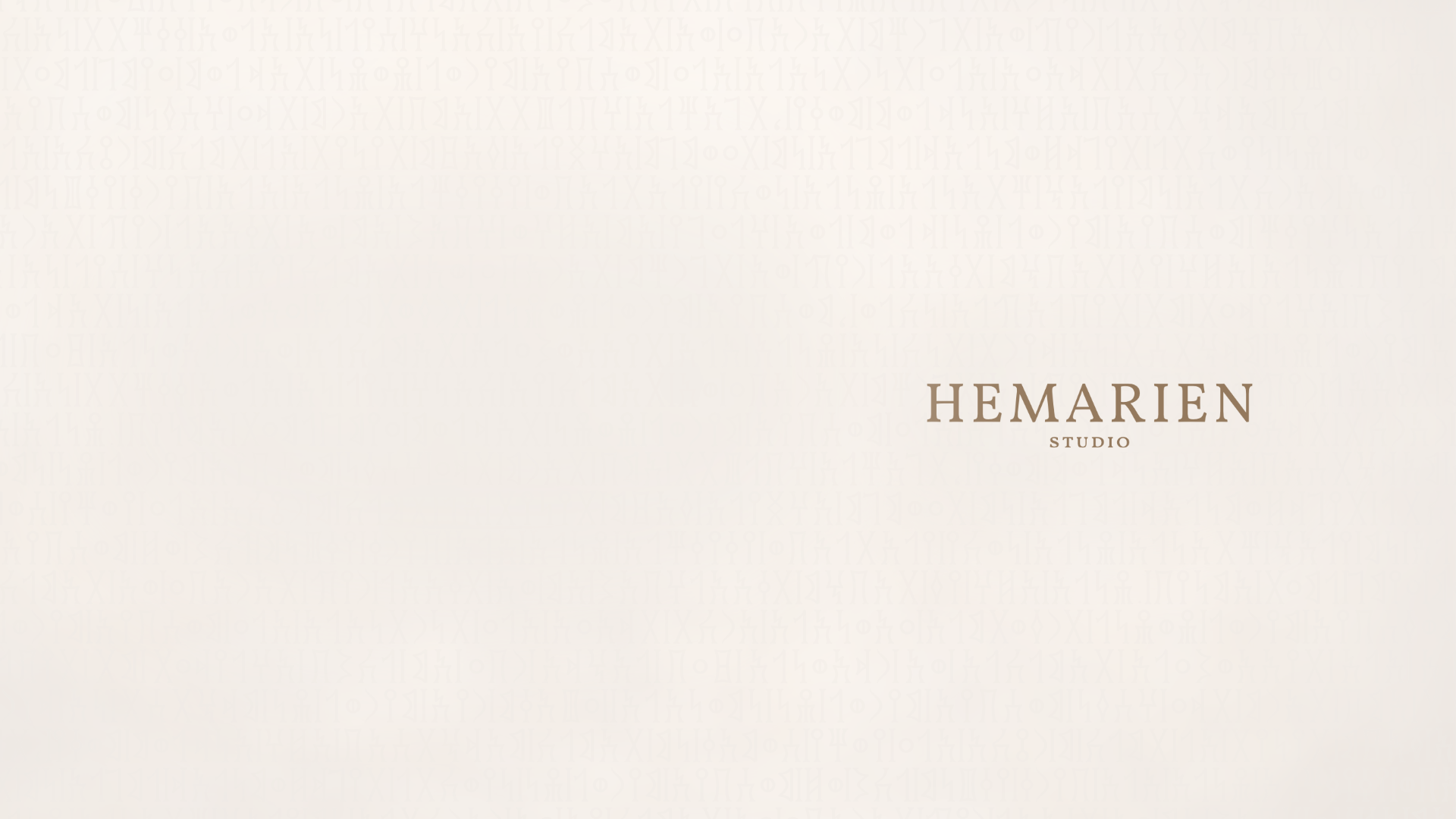
Hemarien Studio
Hemarien is a design-led jewelry and object studio exploring how light, structure, and material interact to create elevated everyday pieces. Inspired by cultural memory and expressed through contemporary design language.
Crafting a Heritage-Inspired Luxury Brand Identity
The visual identity for Hemarien was guided by a central design question:
“How can heritage be distilled into modern luxury without becoming decorative nostalgia?”
This question informed the development of the brand’s visual language, from emblem construction and typography to packaging structure, material finishes, and spatial hierarchy.

Research & Exploration
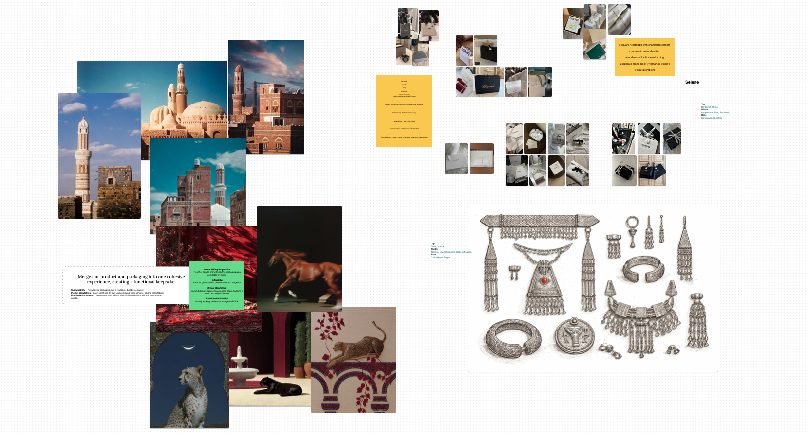
To inform the visual identity, the design process began with research into historical references, craftsmanship traditions, and contemporary luxury brands. This exploration focused on two key areas:
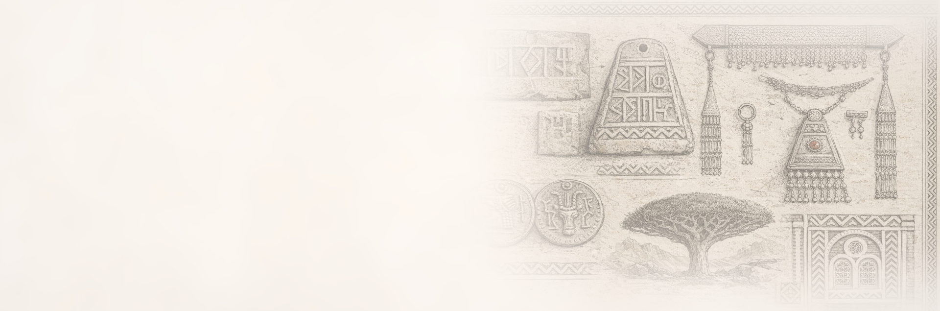
Cultural References
Studying architectural patterns, calligraphic symbolism, and decorative arts from the Arabian Peninsula to understand how heritage has historically been expressed through geometry, structure, and material.Material & Object Design
Examining how proportion, surface treatment, and material choices influence perceived quality, visual balance, and the emotional connection people form with objects.
These insights informed the development of a visual language centered on restraint, proportion, and tactile refinement.
Visual Identity
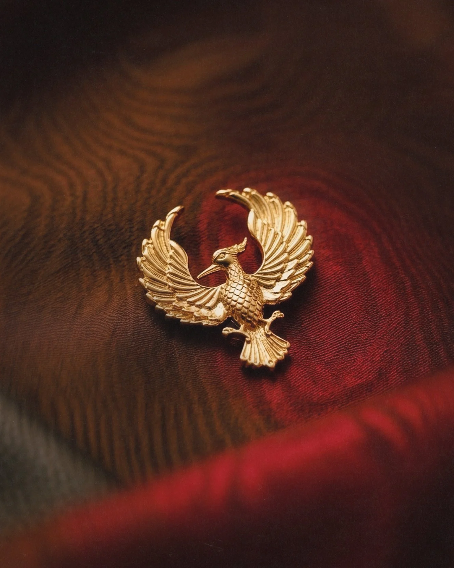
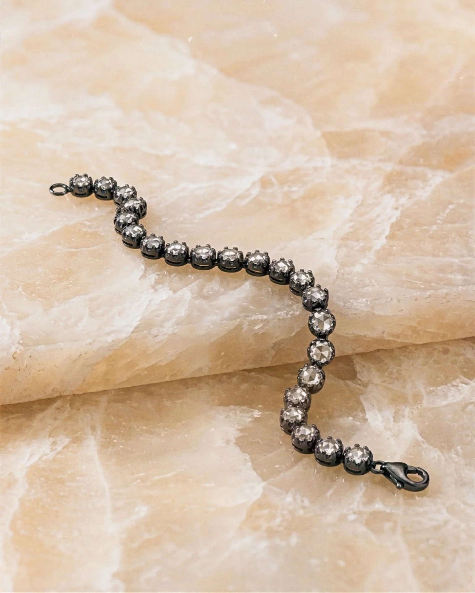
The Hemarien visual identity was designed as a cohesive system where each element—symbol, pattern, color, and material—works together to communicate refinement, restraint, and craftsmanship. Rather than relying on overt ornamentation, the identity focuses on subtle details, balanced proportions, and tactile materials to create a sense of quiet luxury.
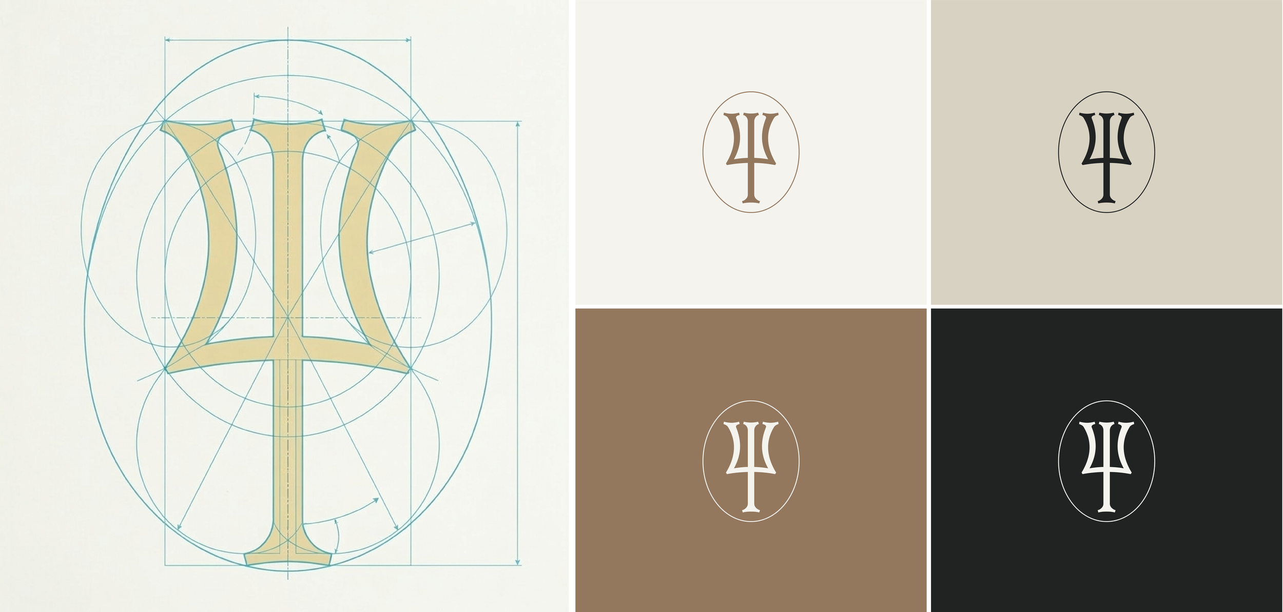
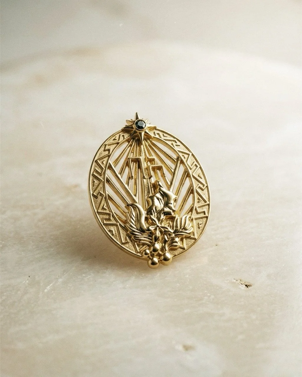
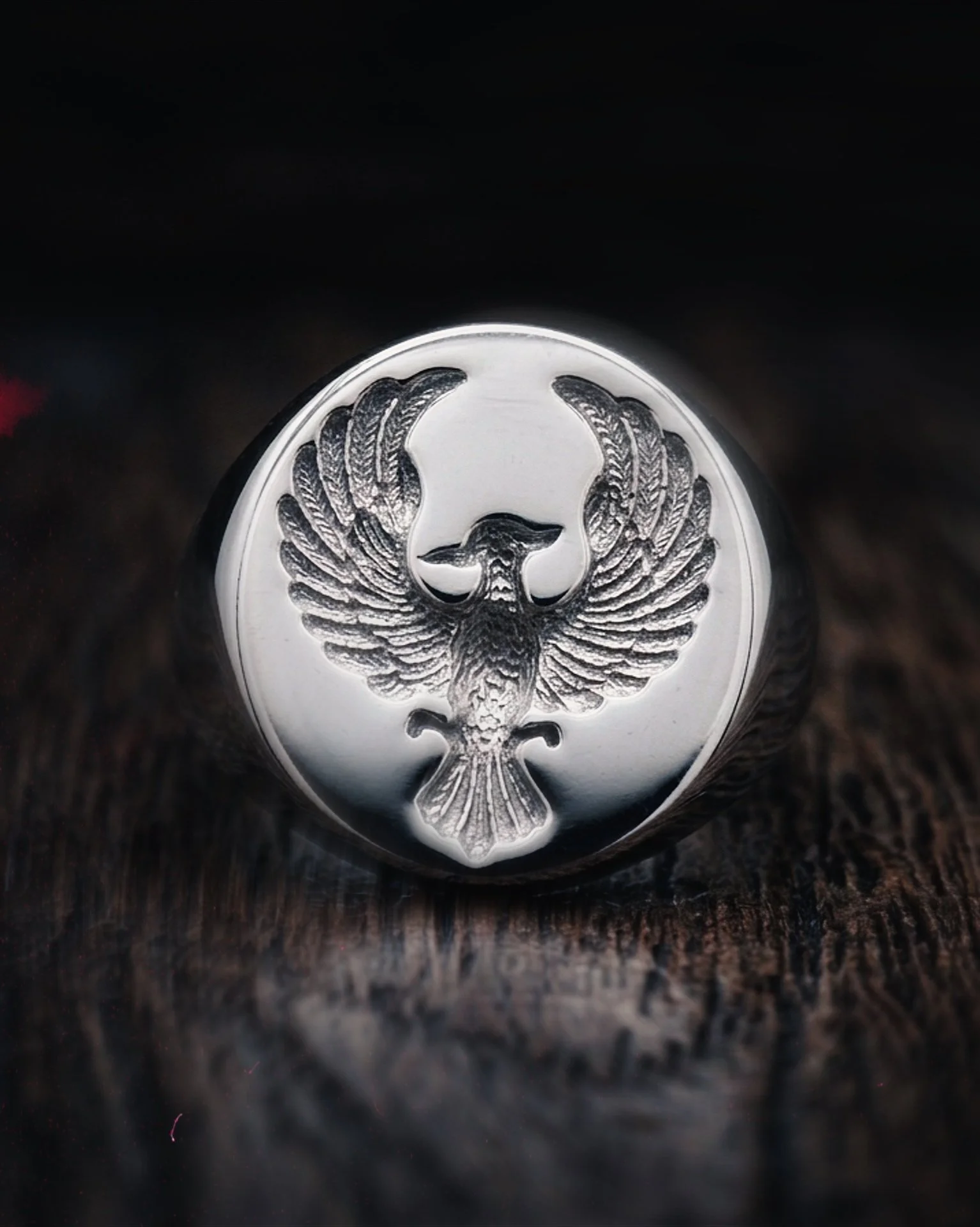
The Emblem
The Hemarien emblem is derived from the South Arabian Musnad script, referencing the letter H, the first letter of the brand name.
The symbol’s vertical form conveys strength and clarity, while its oval frame draws inspiration from historic wax seals and signet marks used to authenticate objects.
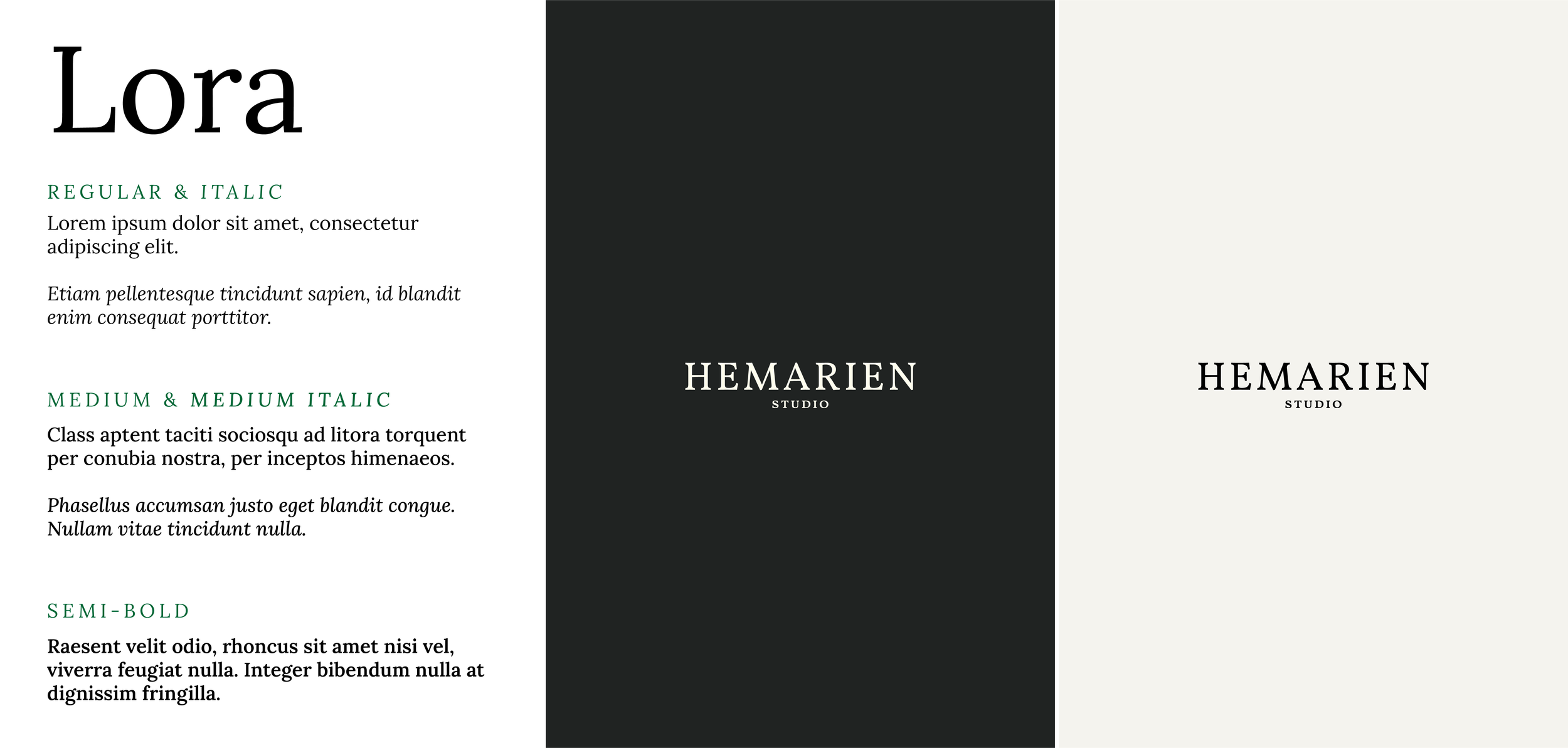
Typography
Typography was selected to complement the brand’s emphasis on structure and restraint.
Clean letterforms and balanced spacing reinforce clarity and sophistication while allowing the emblem and visual elements to remain the primary focus.
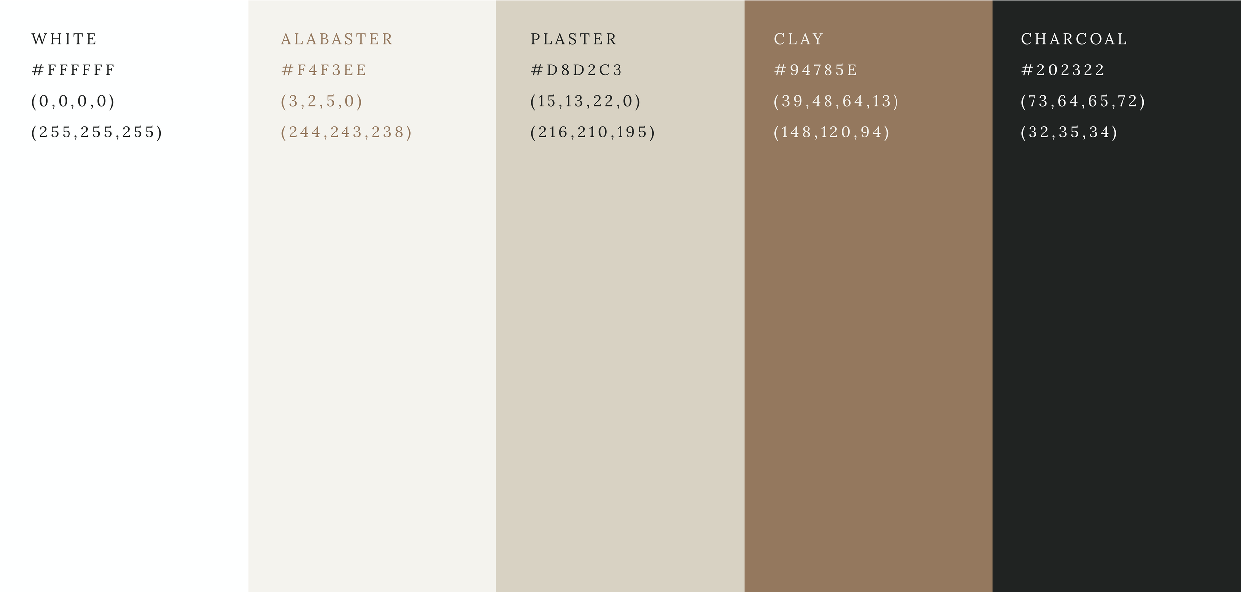
Color System
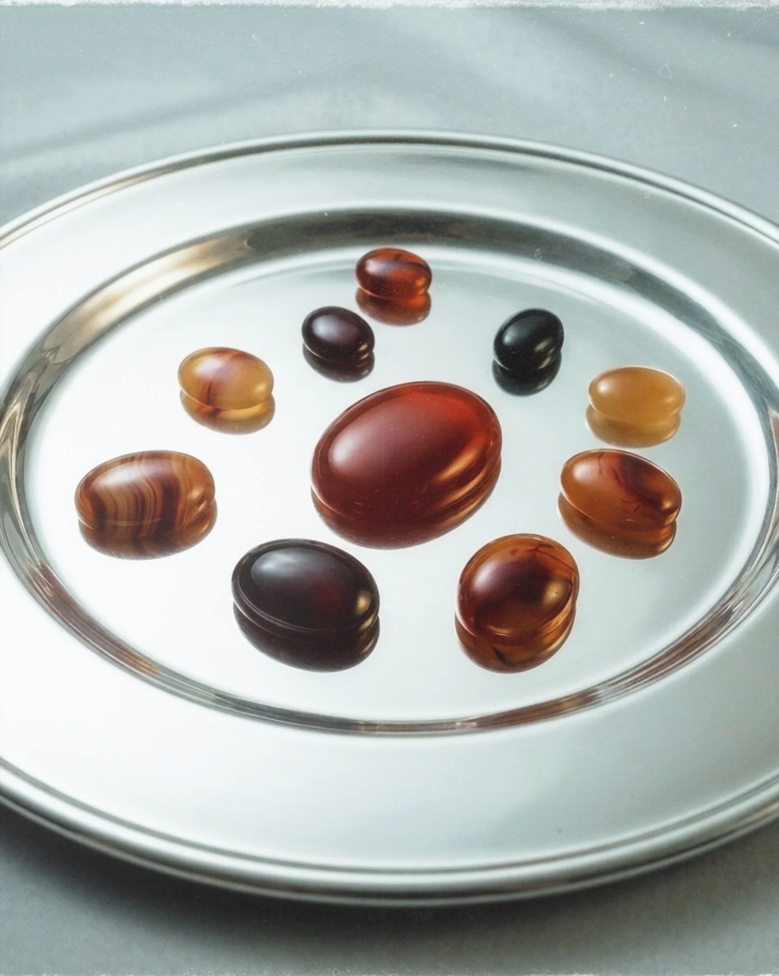
The Hemarien color palette was designed to evoke a sense of material authenticity and quiet refinement. Rather than relying on bright or highly saturated tones, the palette draws inspiration from natural materials historically associated with architecture, craft, and jewelry.
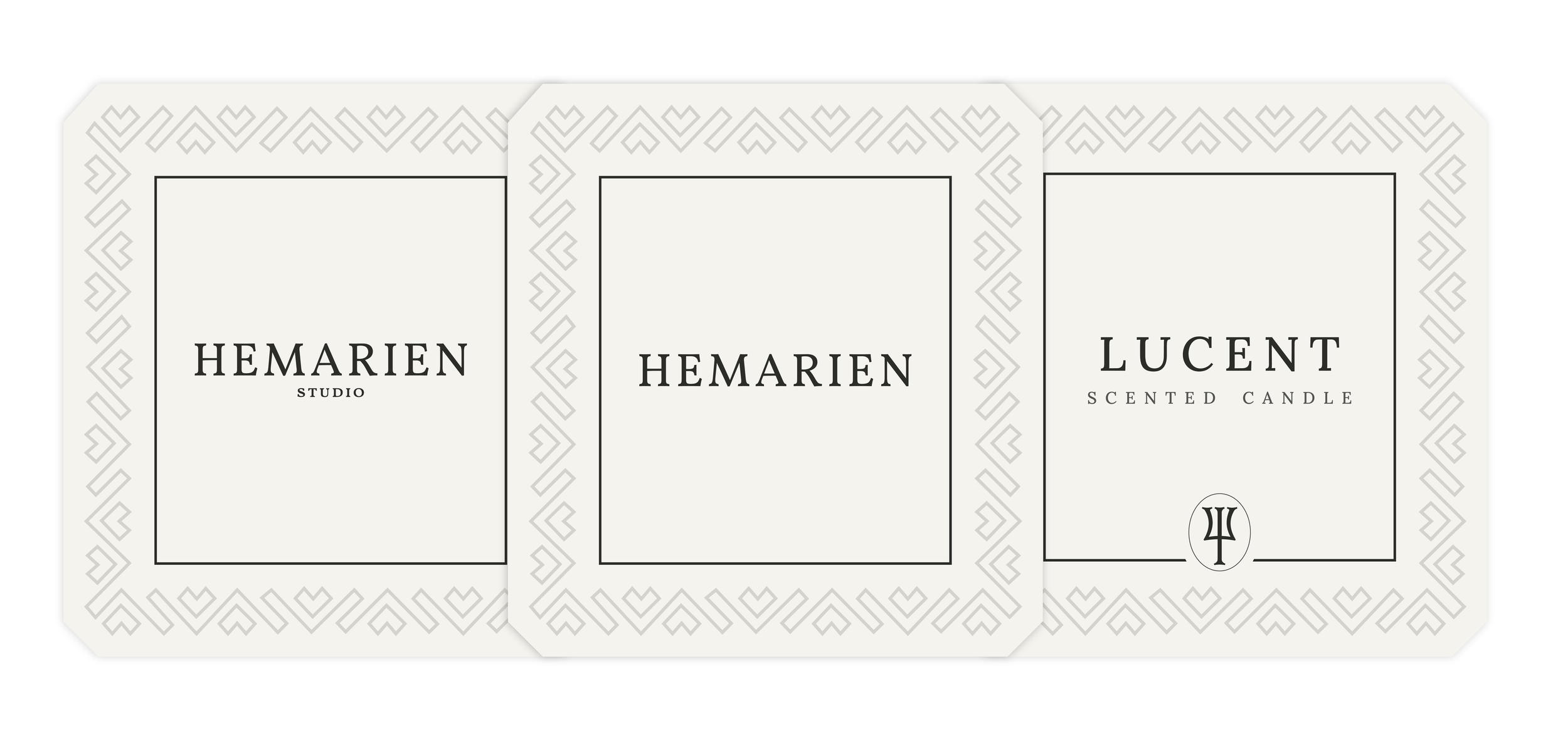
Packaging System
The packaging system was designed as a layered experience that reflects the brand’s attention to detail and material quality.
Elements such as embossed textures, restrained color contrasts, and subtle emblem placement create a sense of ceremony and care in the unboxing process.
Visuals
Focus Areas
Visual Identity System
Experience Design
Packaging System
Narrative Design
Key Deliverables
Logo & emblem design
Typography selection & hierarchy system
Core color palette
Brand Guidelines
Environment
Luxury Brand Identity
Timeline
2024-2025