System Health & Maintenance
The System Health & Maintenance framework was designed to assist in the maintenance and health status monitoring of multiple connected systems. This framework allows for easy interaction with many systems, with a navigation structure that prioritizes faulted systems.
Research
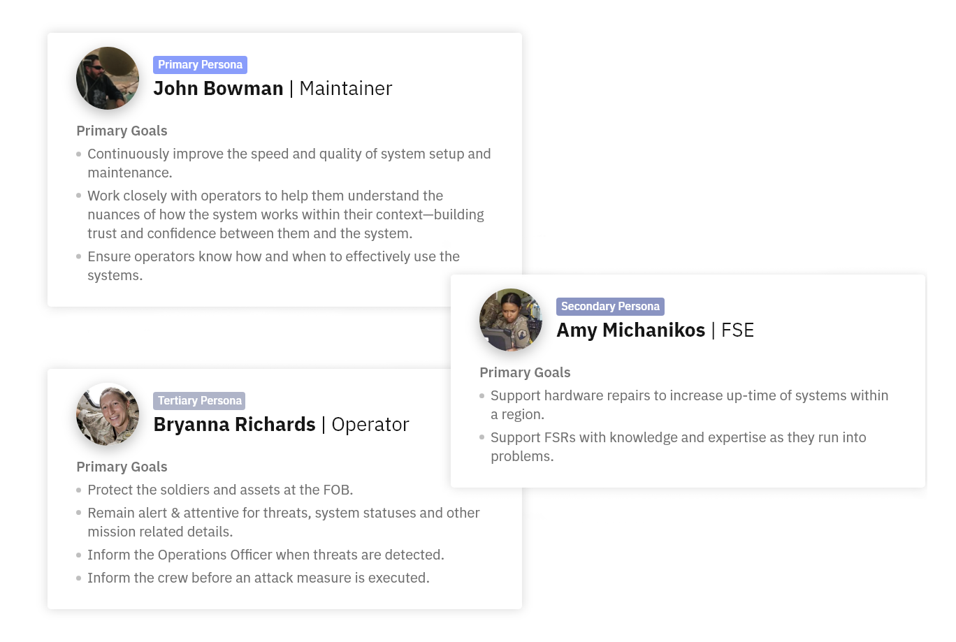
The primary persona that this framework is tailored to is Maintainer John Bowman. Auxiliary personas for this framework are FSE and Operator roles.
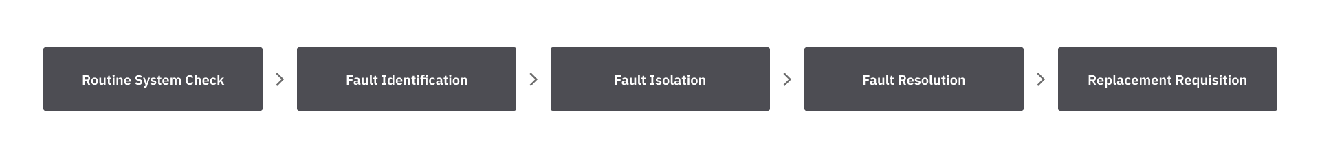
The maintenance framework was designed to align with the maintainer mental model, which is built upon five main modes of thinking: Routine System Check, Fault Identification, Fault Isolation, Fault Resolution, and Replacement Requisition. This model was created based on conversations with maintainers and engineers for the LIDS system.
Five Modes of thinking
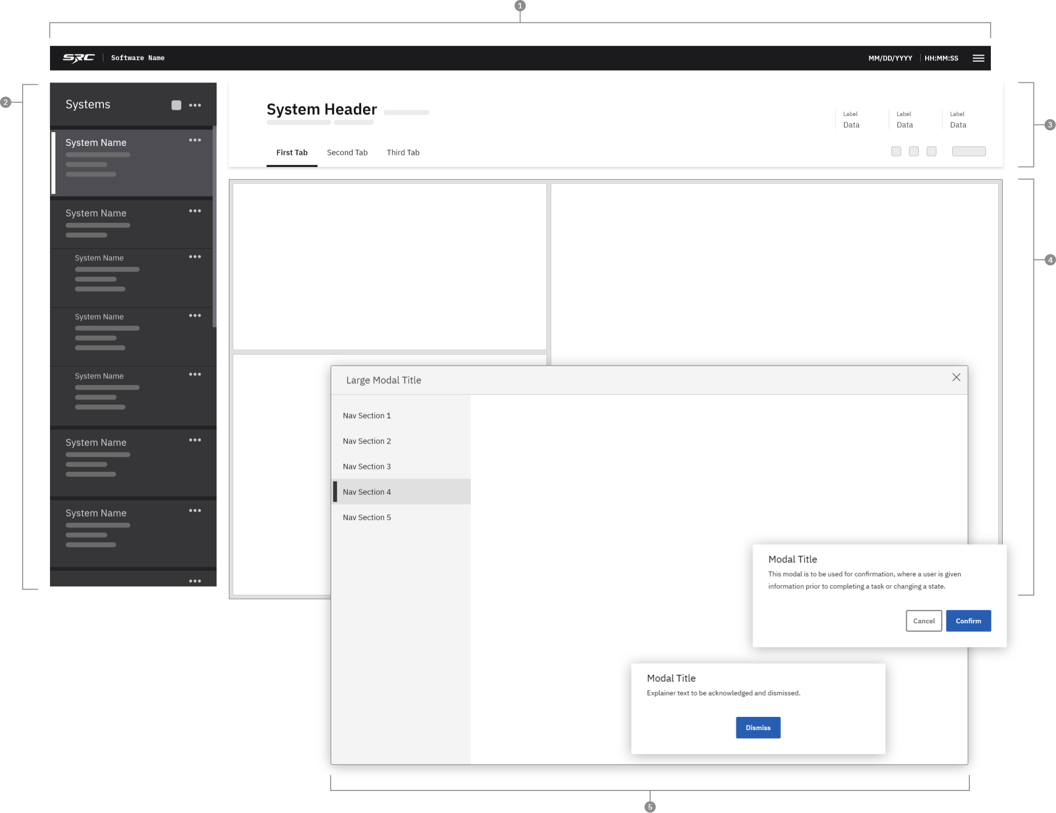
Design Anatomy
Application bar
Systems Panel
System Header
System Content Page
Dialogs
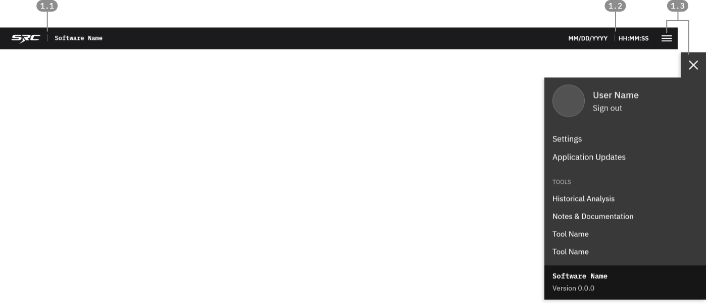
1.1 Application Title
SRC's logo and the application name should be prominently displayed.
1.2 Persistent Information
Persistent information area should include key global information that is not pertinent to, or dependent on any single system.
1.3 Main Menu
In many cases, the software framework will need to have a menu that allows users to access global controls such as application settings, user preferences, network settings, etc.
1. Application Bar
The application header is a permanent fixture within the software framework. Its purpose is to provide access to global controls and persistent information that needs to be accessible at all times while using the application.
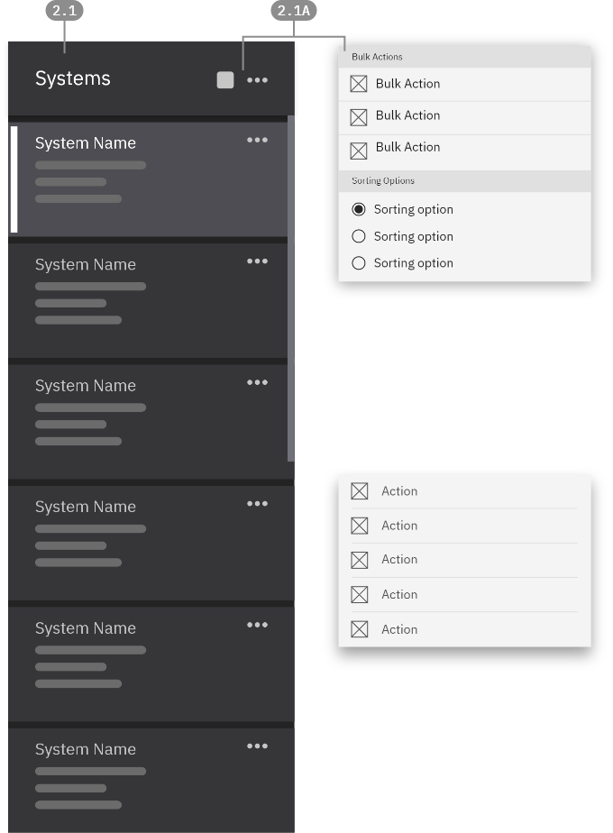
2.1 - Card-Based View
If a variety of system information must be viewed from a high level, it may be best to use Cards as the main navigation item. Cards allow for a variety of content types and information to be grouped and displayed in a single, clickable component.
2.1A - Nav and bulk actions
Buttons in the top section of the panel can be used for high-level navigation item management. This could include viewing options (sort, filter) or bulk actions that can apply to all navigation items.
2.1B Individual maintenance actions
While maintenance actions can be performed within the details page view, it can also be useful to access those actions without having to change your current navigational selection. Having the actions accessible from the Navigation Panel allows for quick actions to be performed without entirely breaking your current workflow.
3. System Header
Application Bar
2. Left Navigation
This panel is used as the highest-level navigational control for in the maintenance framework. Items in the navigation menu represent individual connected systems, or could represent grouped systems-of-systems. This is suited to a systems-first approach to maintenance, and allows users to see all of their systems from a top-down, status-based view. The panel should be flexible enough to contain different navigational components based on the needs of the product.
Nav Hierarchy
The Left Navigation Panel controls the view of all content to the right. Only one system can be selected at a given time.
Systems can take a variety of sorting approaches based on user needs, such as alphabetical, severity-based, etc.
When the panel's content exceeds the bottom border of the panel, it becomes scrollable. The panel should be independently scrollable, meaning that scrolling will not affect any part of the UI outside of the panel.
4 System Content Page
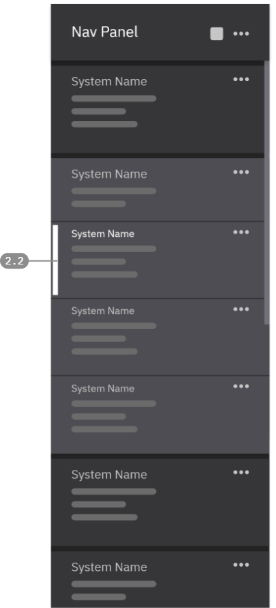
2.2 - Grouped + Nested Cards
At times, it is useful to see Cards that are grouped together or nested beneath a "parent" Card. The narrowed gaps and the smaller type size for the titles helps show the nested relationship of these cards.
Users can still select these nested Cards individually, in which case the entire grouping will take on the "selected" color state, but only the selected card will include the white selection bar.
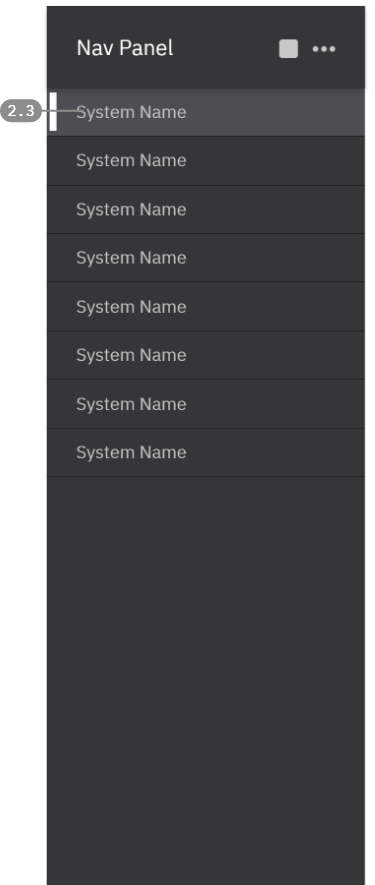
2.3 - Simple List View
When less information is crucial to see at the highest level, a more typical List format may be adopted for navigation items. In this format, simple lines of text are used with minimal decoration to represent individual systems.
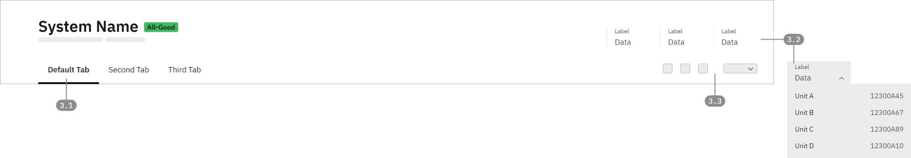
3.1 - Page / Content Navigation
When more than one high level category of system data is needed , content may be broken down into tabs as a means of sub-navigation within the system.
Example:
Default: Assessment/Dashboard
Operational Logs: Captures historical data (alerts, actions, events) for analysis and reference.
3.2 - Persistent System Data Stacks
Data Stacks can include persistent system information such as software version, IP address, hardware version, etc.
Sometimes it can be useful to nest additional data underneath the primary display. In that situation, the data item can become selectable, opening to reveal relevant nested data.
3.3 - Actions and Help Panel
Key maintenance action buttons, as well as a button to open a righthand resource drawer all appear on this line.
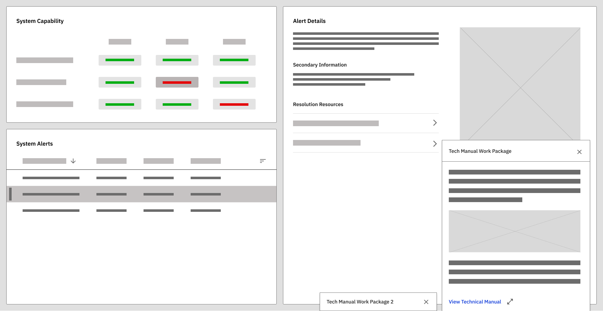
The page was organized into modular tiles, each designed to contain focused, high-priority data sets.
System Capability
Provides a high-level overview of system readiness and operational status.
System Alerts
Surfaces active alerts in a prioritized and structured format.
System Alert Details
Provides contextual information for deeper analysis.
5 Dialogs
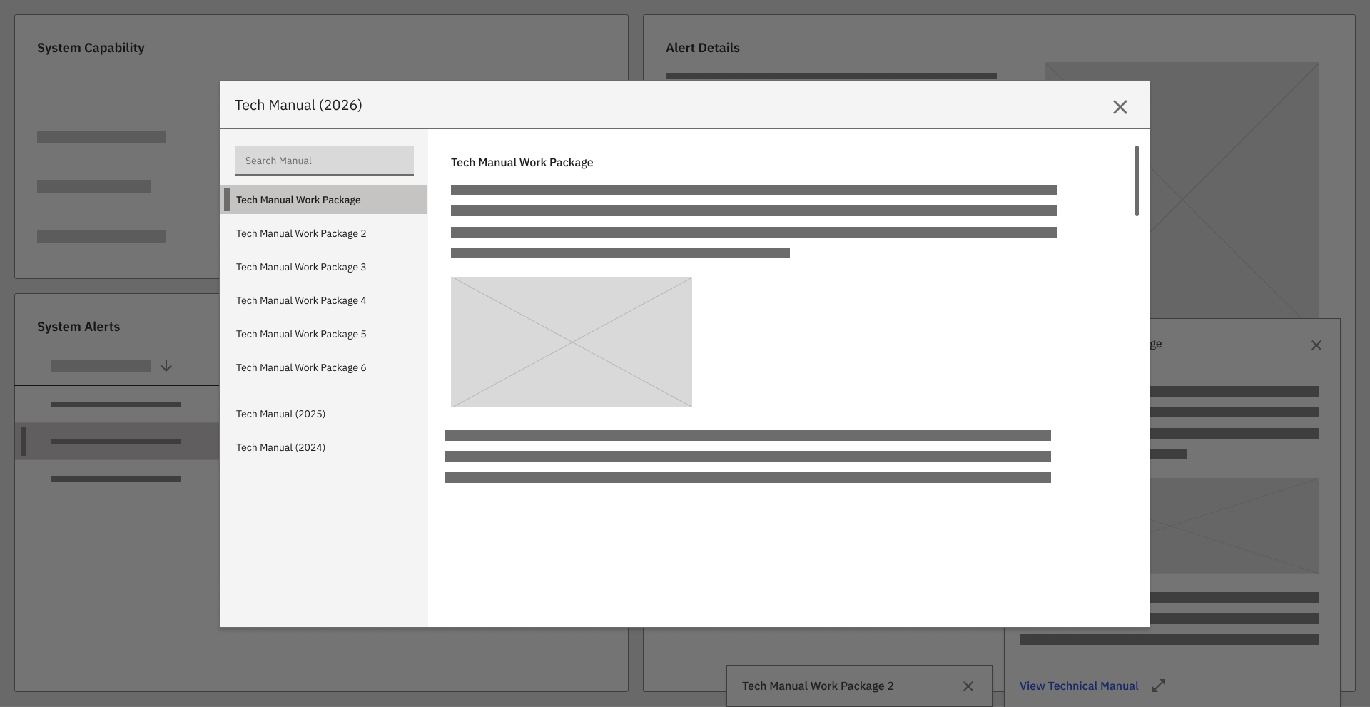
Dialog modals were intentionally used to provide extended information and contextual resources—such as technical manuals and detailed fault descriptions—without disrupting the primary maintenance workflow.
In a legacy system with dense information and complex interdependencies, dialog modals served as controlled expansion points—supporting deeper insight without overwhelming the user interface.
This design approach aligned with:
Maintenance task flow
Cognitive load reduction
MIL-STD-1472 human factors principles
Reduced reliance on memorized procedures